DECONSTRUCTING A WORK OF ART
As we’ve seen in the previous article, color in astrophotography can’t be used just any way we want. Even in narrowband, colors are assigned to specific chemical elements, such as red for Hydrogen, blue and green for Oxygen, orange for Sulfur, etc. Some people get more creative and mix percentages of each filter to create wonderful compositions… some of which are great, while others are horrible, and most of them look like clones of each other. Anyway, I won’t tell anyone how to process their images – it’s up to each person to decide how much «drama» or «effect» they want to add.
One common technique is to boost the R channel to make H-alpha more visible. Some people boost it so much that everything becomes red, and the photo looks like the South African flag. That’s not the case here, but I’ve chosen this image because it’s very easy to «deconstruct» and serves as a great example of how a photo can be spectacular without having to paint areas with a specific color.
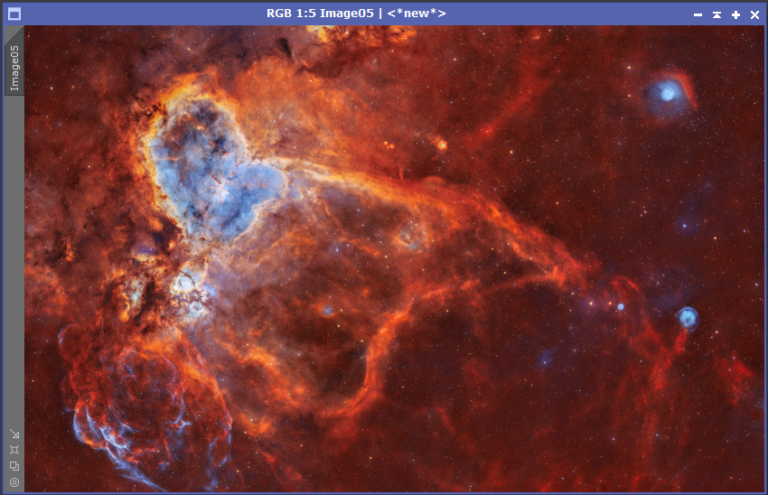
We have the handicap of working with a processed JPG, but I’m sure you’ll understand quickly when you see the histogram. This is an image of the large field of IC 1805 in the constellation Cassiopeia, the famous Heart Nebula. This image was APOD at one point and received many accolades from the astrophotography community. At first glance, it’s impressive, but if you analyze it with an astrophotographer’s eye, you’ll notice that something doesn’t add up. It’s not possible for everything to be red, no matter how much narrowband data there is or how much H-alpha there is in the surroundings and the nebula itself.
If the background were all red, the curve of that channel wouldn’t start in the middle of the histogram. That would only be possible if the R channel were blown out, and the statistics don’t indicate that. First of all, it’s worth noting that this is a photo taken with an enormous amount of data, with over 400 hours of total exposure time across three narrowband filters: 141 hours for H-alpha, 143 hours for Sulfur-2, and 120 hours for Oxygen-3. That’s a truly massive amount of data. In addition to being APOD, it also received the top prize in Astrobin, the largest astrophotography community in the world.
This is the image:
As you can see, the photo is amazing, but what happens if we open the histogram?
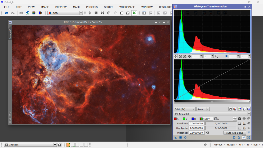
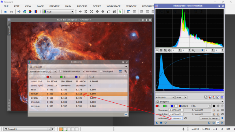
Indeed, the whole part where the red should be occupying low values, that is, where the red color would start to be part of the background, is simply overexposed, and what it does is cover up or «paint» that entire part of the red shadows, covering up the shadows of the green and blue channels. In other words, if there are blue or green structures in that part of the photo, they simply get painted red because the intensity given to it is so high that the other two channels can’t be seen. But they’re there, the histogram says they’re there, but we can’t see them because of the red channel’s excessive intensity. Take a look at the statistics:
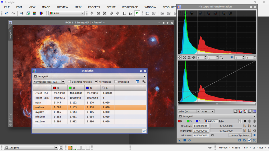
The average of the red channel is three times higher than the other two channels. Look at where the R channel starts in the histogram. What happens in the shadow area? What happens on the left side of the R channel? It’s like the volume button is turned up to 9 compared to the other two channels, which are at 1. This is incorrect because you’re covering up data from the other two channels, and there’s no need to do that. The mission of every astrophotographer is to show the maximum amount of data in the photo without sacrificing any channel for the benefit of another. This is what we call «painting» in the jargon.
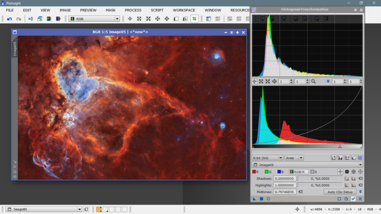
How can we re-balance the photo? Theoretically, it’s simple. It would be enough to set the average value of each channel to the same «power», meaning the averages would weigh the same. To do this, we need to take each channel and set the average value as the mid-tone value, channel by channel, and then equalize the combined RGB channel. It sounds complicated, but it’s very easy. We just copy the average of each channel and introduce it into the «midtones» box and press «enter»
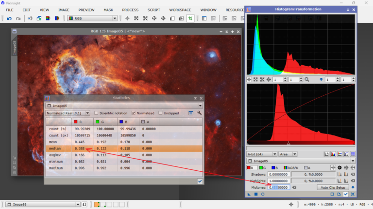
The same we’ll do for the green channel and for the blue channel.
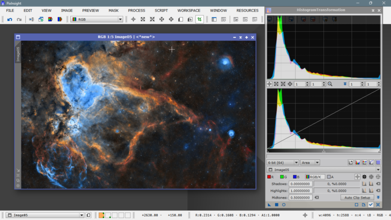
Next, by adjusting the central slider, we’ll move the entire top graph, the RGB channel, to the same height as the bottom one, to have the same total level of illumination.
Now the colors are where they should be. You might notice a bit of excess green noise—no problem. Just run SCNR (a tool to reduce chromatic noise in the green channel), and voilà:
At this point, you’d move on to further processing—but we can’t do that here because we only have the JPG version, not the original stacked data. Still, this example shows that from a more “scientific” perspective—and I use that term loosely—this version is much more balanced. If we had the original files and didn’t “paint” things where we felt like, we’d probably end up with something close to this:
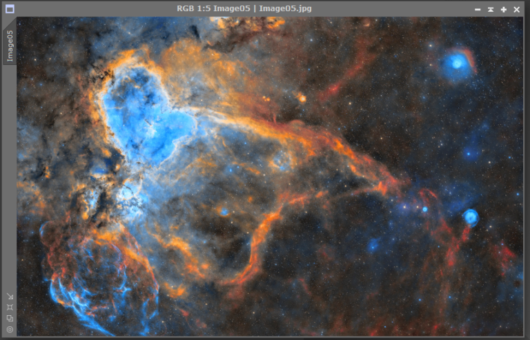
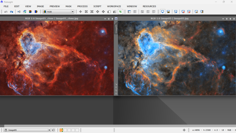
In the comparison, you can clearly see that each structure has its own distinct color—there are greens, yellows, reds, and even some blues—exactly where they’re supposed to be. It’s no longer just a giant red blob. We’ve gained contrast, accuracy, and a better representation of the true nature of the nebula by assigning the correct color to each element.
Here’s the side-by-side:
Just to be clear: the results shown in this article are not meant to be definitive. The goal isn’t to impose any opinions or lay down the law—I’m simply sharing my personal perspective and backing up my observations with reasoning. I’m also not trying to criticize or diminish anyone’s work. The image I used is just a helpful example to illustrate some key concepts and explain a few basic color processing techniques. So, if anyone feels offended, please accept my apologies in advance.
Hope you enjoyed it!
Ferran.