UNDERSTAND PIXINISIGHT STATISTICS AND HISTOGRAM AND HOW TO USE THEM. DILEMMA BETWEEN PROCESSING OR PAINTING.
In this article, we’re going to talk about something fundamental in image processing: understanding the histogram and the statistics box. What do these graphs mean, and how can we use them to improve our images? We’ll focus on color equalization, especially when working with wideband or narrowband images.
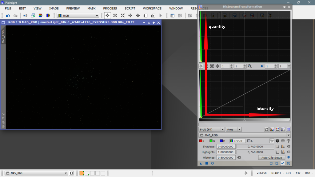
Imagine you’re working with an image that looks like an undeveloped negative. The histogram shows us the distribution of pixels based on their intensity. The vertical axis represents the number of pixels, and the horizontal axis represents the light intensity. The more to the right, the more light and intensity; the more to the left, the darker and less intensity.
In our example image, taken with a color camera with a Bayer matrix and a UV/IR cut filter, we can see that all the information is concentrated on the left side of the histogram. This means the image is underexposed and needs more light intensity. The peaks of the three channels (red, green, and blue) are well represented, but without intensity.
Color equalization is crucial to avoid having our images look «painted» with one color or another. We want to assign each color to its corresponding place, without falling into «artistic» temptations that distort reality. In this article, we’ll explore how to equalize our images correctly and avoid common mistakes.
Let me know if this meets your requirements or if you need any further adjustments!
Stretching or revealing a photo can’t be done just any old way. Nowadays, we have color calibration tools that we need to use before stretching, otherwise we’ll be stretching without knowing if the color disposition is correct or not. In a typical RGB image taken with a color camera, the green channel should be worth twice as much as the red and blue channels in relation to the captured information. The commercial sensors used in these cameras are designed for everyday photography, «daytime» photography, and are meant to produce colors that match what the human eye expects to see. However, these cameras are photographing the dark sky without any filter that strictly cuts off the visible spectrum, and can capture beyond the far infrared, which is the color of most deep-sky objects, namely ionized hydrogen.
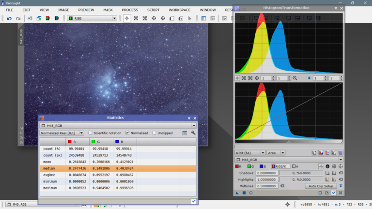
Now let’s take a look at the statistics. This box is extremely important to know how to read, it will provide us with very good information and we’ll know if we’re processing well or poorly.
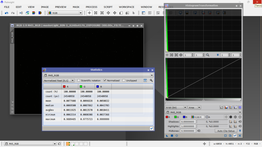
The COUNT (%) indicates the percentage of pixels in each channel that have managed to reflect in the photo. The COUNT (px) indicates the exact number of pixels in each channel that have «made it alive to the digital form». MEAN is the arithmetic mean of the illumination value of each channel, remember that the lower the value, the darker, and the higher the value, the more illuminated. Notice how they still have two zeros after the decimal point. MEDIAN are the illumination values that are at the center of the entire series of values for each channel, if it were the volume knob on a sound device, this would be like setting it to 5 on a scale of 1 to 10. AVGDEV is the mean absolute deviation from the mean value, that is, the «rebellious and unruly» values, which generally indicates how noisy each channel is, the higher this number, the worse. MINIMUM The value of the darkest pixels in each channel. MAXIMUM The value of the most illuminated pixels in each channel.
The first conclusion we can draw from the statistics box is that we have given it a correct exposure, since we haven’t saturated any channel, that is, if we had a value of 1.0000000 in MAXIMUM, it would mean that we have overexposed the photo. On the other hand, if we had values of, for example, 0.0000000, it would mean that we have that channel underexposed or that that band of the spectrum is not present in the photographed object, which is highly unlikely.
Now we’ll calibrate the color with Spectrophotometric Color Calibration and see how the statistics change.
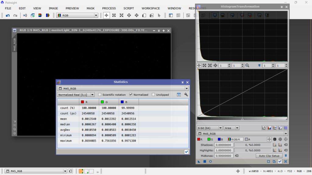
By doing a correct color calibration, and since it’s a wideband image, the statistics for each channel are quite similar. Since we’ve told the program what type of object it is, what sensor we used to take the photo, and what filter we used, the result is almost perfect. There’s no channel dominating the others, except for the logical differences in intensity (MIN/MAX) caused by the presence of certain structures that facilitate the capture of specific colors. In this case, it’s the Pleiades, and since it’s a reflection nebula (mainly blue) with some emission (red), the blue MAX value is slightly higher than the red one, and even higher than the green one, which is represented in smaller quantities due to being part of pure visible white light.
Now let’s move on to stretching, i.e., illuminating and giving intensity and contrast to both luminance (light) and chrominance (color). A very good way to do this is with Masked Stretch, which is the method I personally use, mainly because it protects the brightest areas and doesn’t saturate them. With MS, stretching is iterative, and we can specify how many iterations we want to perform with small stretches to reach a certain background value. At each iteration, it creates a mask that applies to the brightest areas so they don’t blow out, allowing us to represent the image with a wider and more suitable dynamic range. Okay, after stretching the image, the statistics look like this:
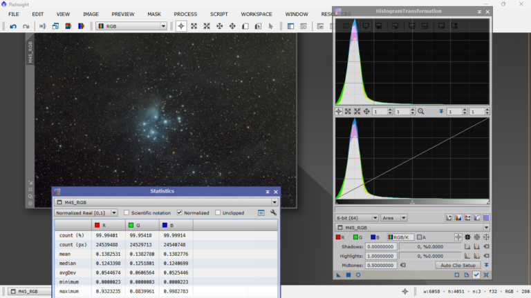
We can see that the statistics remain well balanced between the different channels, and that the only thing that has happened is that the mean and median values have changed, and to a lesser extent, the other parameters. This indicates that the stretch is correct. Now let’s move on to the topic of «painting» or not painting. The photo is now ready for «artistic» processing, we’ve already done the scientific processing, and now it’s time for personal preferences, such as illuminating more or less the background, giving more or less contrast, saturating more or less the colors, etc. The problem is that we often have a preconceived notion of how a particular object should look, according to the standard. In this case, the Pleiades, we all expect them to be blue and surrounded by a lot of blue gas. If you’re not careful, you risk «painting» the image, i.e., giving more intensity to one color to make it stand out over others. This often happens in images that supposedly have a lot of H Alpha, but it also happens with the Pleiades, and many people succumb to the temptation of moving the blue channel slider to the right, with the consequent contamination of the other two channels, creating a blueish dominant that’s quite unaesthetic and unrealistic. I’ll do it myself, so you can see how bad it looks and how it affects the histogram and statistics.
How bad, right? We know there’s a lot of gas that shines with a blue color due to the high temperature of these young and hot stars, but painting it in such a crude way is not something that occurs to anyone. However, in images where there’s a lot of H-alpha, many people do it without caring at all, and it seems to be accepted that if there’s a lot of hydrogen alpha, it’s correct to see everything contaminated with red, the other two channels completely overwhelmed by the red channel, and nobody says anything about it.
In the next chapter, we’ll deal with an image that was once APOD and received many praises from the astrophotography community. We’ll simply «deconstruct» it and leave it as it should really be presented, despite having the handicap of being a processed JPG. But I’m sure that when you see the histogram, you’ll understand quickly.